We originally published this Insight on Kovitz.com/Insights. Through Kovitz, we offer wealth management services and have collaborated with our clients on their investment decision-making process as they pursue their long-term financial goals. Our investment solutions are backed by our own stringent research, and we view financial planning and wealth management as active and ongoing processes.
There’s a certain ease of use that comes with the quotation of a Price-to-Earnings ratio (P/E). On television, in print or with friends at the country club, the P/E ratio is frequently used as the sole data point to justify whether an investment is cheap or expensive, and thereby inferred to be predictive of upcoming price movements in the stock market. The beauty of the P/E ratio is the figure is easy to calculate and it makes intuitive sense. In the numerator is the price of the stock market index or one share of stock today. In the denominator, the amount of earnings per share the combined market or company is expected to generate in the future or generated in the past (usually a 12-month look-ahead or look-behind window). Comparisons are easy, too. If one could buy $1 of earnings for $10 (a P/E ratio of 10) in Company A, why would one buy shares of Company B for $16 with the same $1 of earnings (a P/E ratio of 16)?
Already, a potential spot for disagreement is apparent. A trailing P/E ratio has a high level of certainty embedded in the metric because the ‘E’ is sourced from financial reports with concrete numbers. But stock prices are a reflection of future expectations, meaning a trailing 12-month P/E ratio can have limited value when it comes to predictive power. Enter the forward P/E ratio. Using individual, expert or consensus estimates to predict future earnings per share results, the denominator is improved by matching the forward-looking price with a forward-looking earnings figure. Of course, there is a tradeoff. Estimates seek to predict the future, introducing an element of uncertainty not found in the trailing version of the metric.
Longer-Term Measures
In Security Analysis, a now-famous book written in 1934 by fathers of Value investing Benjamin Graham and David Dodd, the duo argued in favor of an average calculation for ratio analysis because it “shifts the original point of departure, or basis of computation, from the current earnings to the average earnings, which should cover a period of not less than five years, preferably seven or ten years.”
More than five decades later, Ivy League professors Dr. John Y. Campbell and Dr. Robert J. Shiller built upon Graham and Dodd’s work. Their analysis was published in the Journal of Finance, and extended the average earnings window to 30 years, concluding, “Our results indicate that a long moving average of real earnings helps to forecast future real dividends. The ratio of this earnings variable to the current stock price is a powerful predictor of the return on stock, particularly when the return is measured over several years. We have shown that these facts make stock prices and returns much too volatile to accord with a simple present-value model…We think that it can be argued that a long moving average of earnings is a very natural variable to use to represent fundamental value, and that there are not many competitors for this role.”
Dr. Shiller built upon his earlier work and popularized the CAPE ratio–or Shiller P/E–in Irrational Exuberance, a book published near the peak of the Dot-Com Bubble in 2000. Because near-term gyrations can cause P/E ratios to fluctuate wildly, Dr. Shiller’s calculation takes into account a ten-year average of earnings per share and pairs that with the current price. The academic analysis associated high CAPE ratios (when the market is purportedly expensive) with relatively poor future returns, while low CAPE ratios (when the market is purportedly inexpensive) were associated with higher future returns.
The Shiller P/E Ratio Since 1926
The latest CAPE ratio reading is 28.9, which Figure 1 shows is above average. An elevated CAPE might be a cause for worry, just as we suspect a CAPE ratio above 20 would have caused a lot of concern in the early 1990’s given the average ratio had been a paltry 14.7 in the 60-plus years preceding Black Monday. In the years since, the average has been 25.8, which also feels elevated compared to the historical record, but we must warn there is no fundamental requirement for the CAPE to retreat.
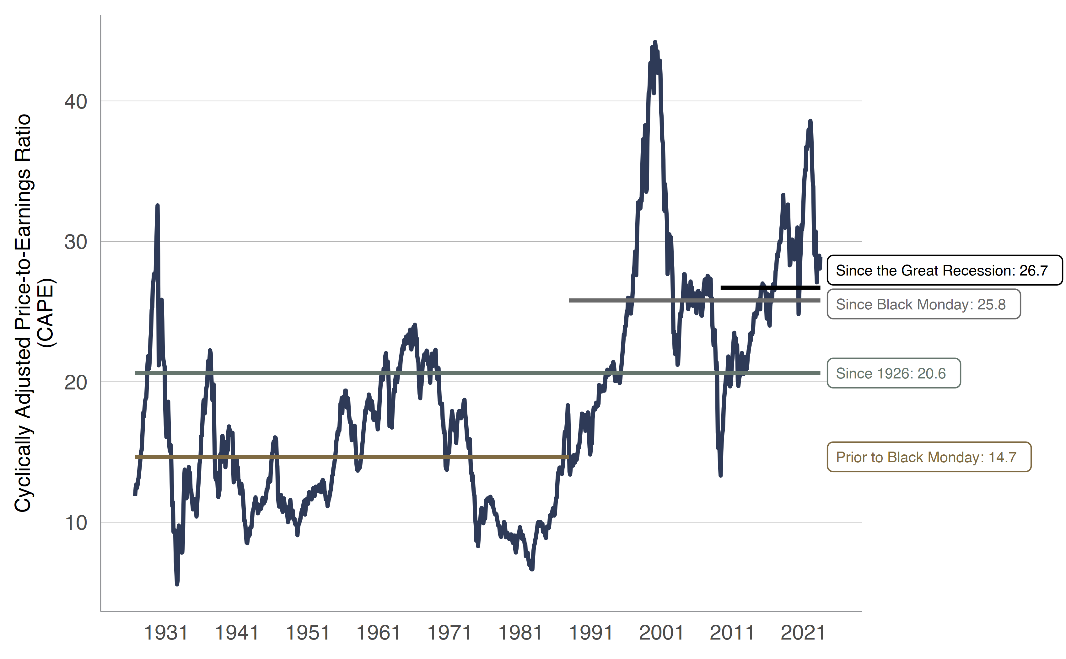
From 07311926 through 04302023 Horizontal lines indicate mean figures for specified time periods SOURCE Kovitz using data from Professor Robert J Shiller and Bloomberg Finance LP
CAPE Ratios & Subsequent Performance
Slicing and dicing CAPE ratios into buckets with equal membership since 1926, we find lower CAPE ratios (smaller bucket numbers) tend to correspond with better subsequent five-year returns periods than when CAPE ratios are higher (larger bucket numbers). Because rolling five-year windows exhibit significant overlap and the CAPE ratio tends to move slowly (by design), the conclusion that low CAPEs predict better returns than high CAPEs is less robust than it might appear.
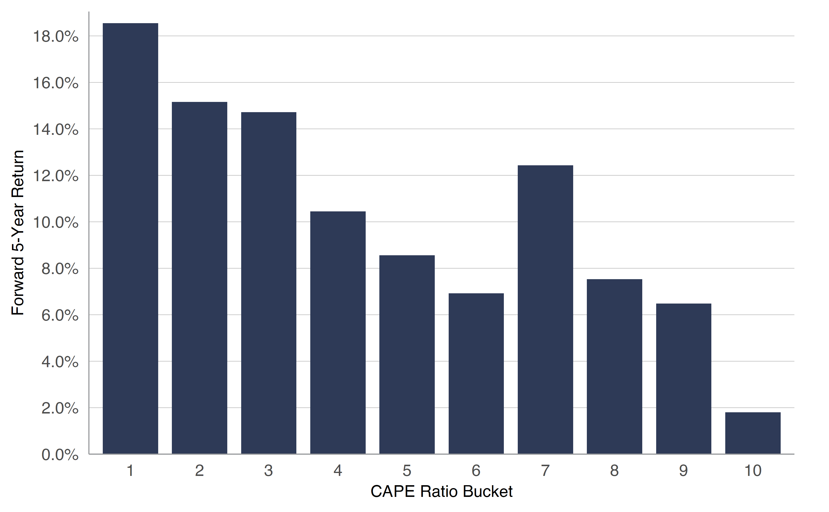
From 07311926 through 04302023 Bucket 1 captures the lowest 10 of CAPE ratios often considered the most undervalued Bucket 10 captures the highest 10 of CAPE ratios often considered the most overvalued Subsequent five year returns SOURCE Kovitz using data from Professor Robert J Shiller and Bloomberg Finance LP
A compelling exhibit supporting the CAPE ratio’s predictive power is presented in Figure 3. Terrific five-year returns followed periods with low CAPE ratios, while subsequent performance has been dreadful when the CAPE is above 35. The details matter. There are 131 periods represented by the bar with CAPE ratios between 5 and 10. Just 44 rolling periods make up the rightmost bars with high CAPE ratios and all of them were from 1998 and 2000, a period followed by a steep market plunge.
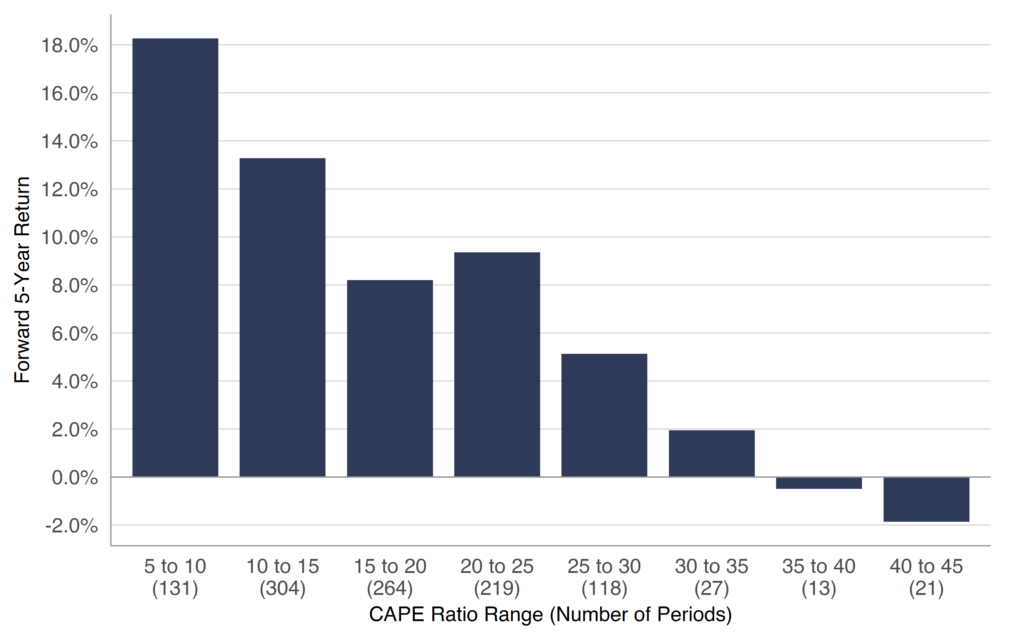
From 07311926 through 04302023 SOURCE Kovitz using data from Professor Robert J Shiller and Bloomberg Finance LP
S&P 500 Differences
The preceding text offers evidence the time period plays an important role in indicating the stock market’s relative expensiveness. Index calculation methods matter, too. In Figure 4, we chart P/E ratio differences between the value-weight (market cap) S&P 500 index and its equal-weight sibling. The spread is usually not vast, but it can be meaningful if the metric is used as dividing line. On April 30, the P/E for the cap-weighted index was 19.9x, while it was 17.5x for the equal-weight version.
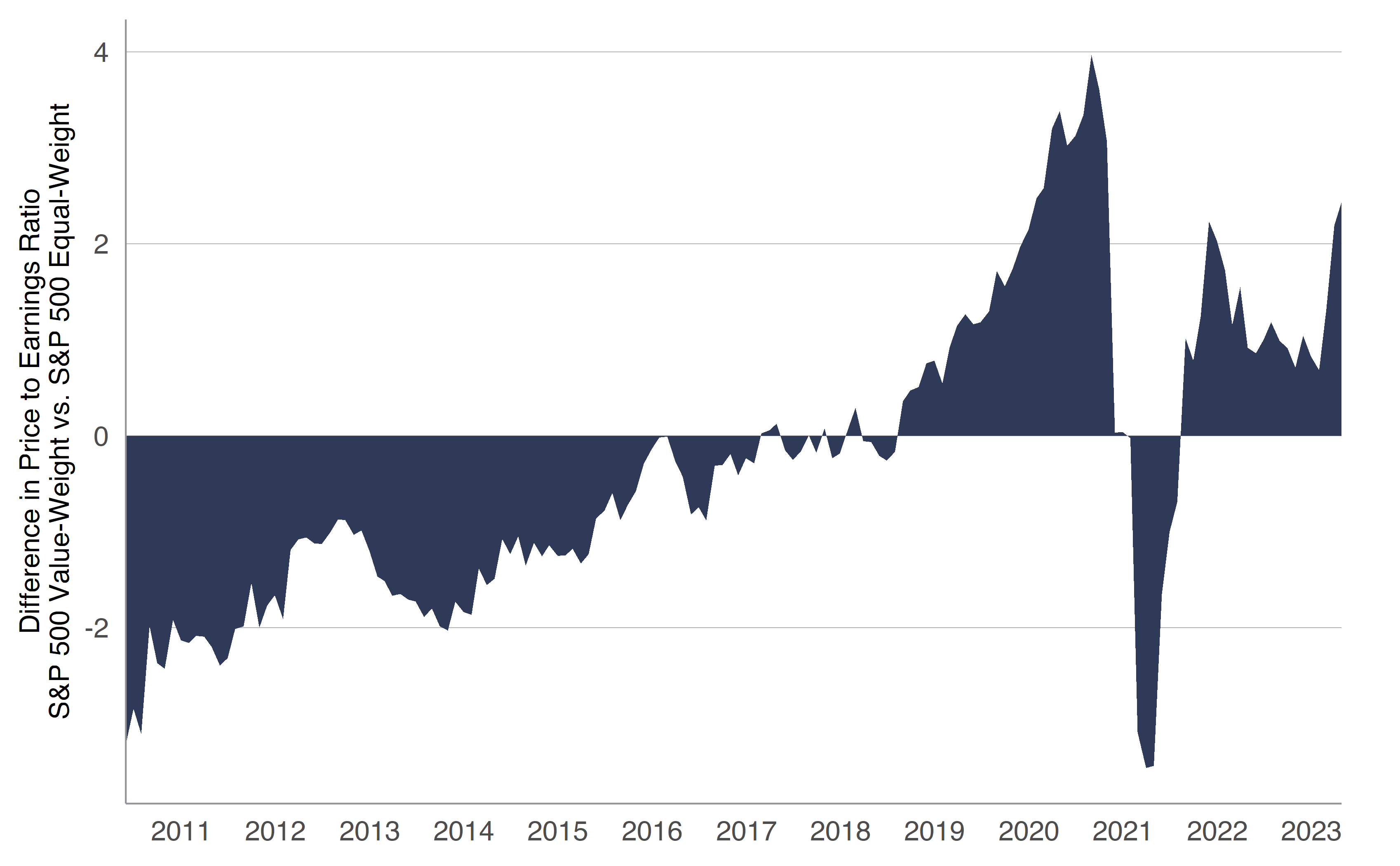
From 05312010 through 04302023 Trailing 12 Month Price to Earnings Ratio SOURCE Kovitz using data from Bloomberg Finance LP
Reviewing Data for S&P 500 Members
Index provider data is useful, but we also like to crunch our own numbers using the large datasets available to us. Figure 5 shows weighted average trailing P/E ratios for S&P 500 index members, calculated by sector. There are two points we find interesting: 1) there is large variability in the P/E ratio depending on the sector and 2) P/E ratios tend to stay within tolerance bands for each sector, with the exception of a large rise in P/E ratios for Info Tech companies.
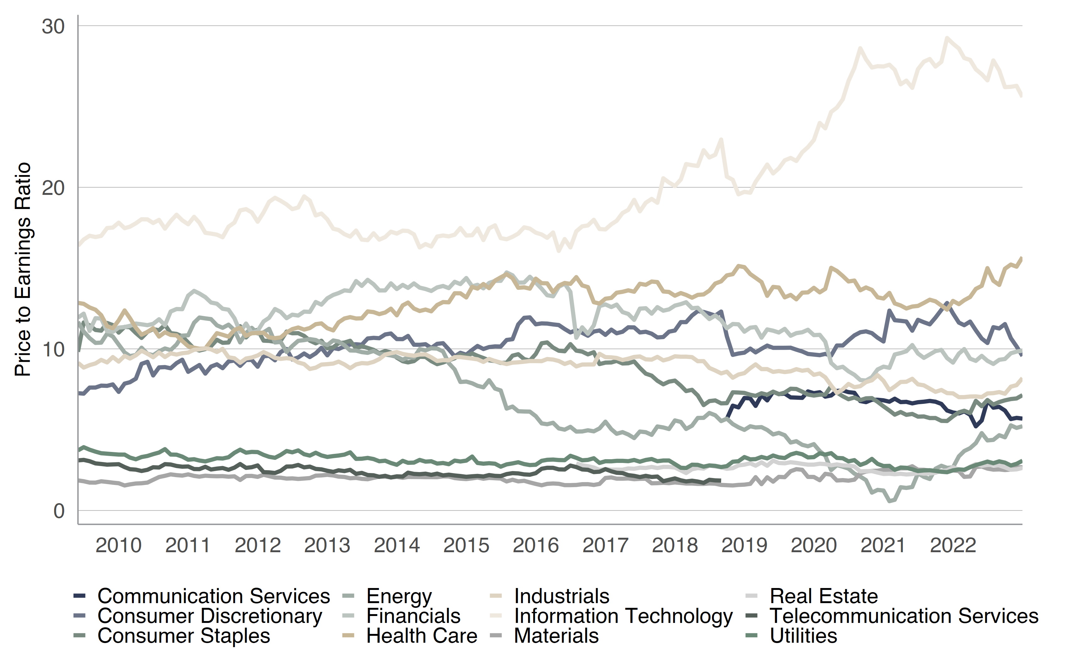
From 05312009 through 12312022 GICS is the Global Industry Classification Standard In 2018 a major classification shift created the Communications Services sector which is primarily comprised of companies formerly in Telecom Services and Information Technologies sectors Calculated using available data for the SP 500 index SOURCE Kovitz using data from Bloomberg Finance LP
Long-Term Investing is Key
Dr. Shiller’s CAPE ratio is frequently cited as a reason to take near-term action, usually shifting allocations between stocks and other assets. We consider this a dangerous use of CAPE ratio, especially as Dr. Shiller’s work concludes the ratio has predictive power using a “long moving average [of earnings]” and subsequent returns “measured over several years.” While some CAPE ranges might be more attractive, Figure 6 shows positive returns have been the default as the time horizon widens.
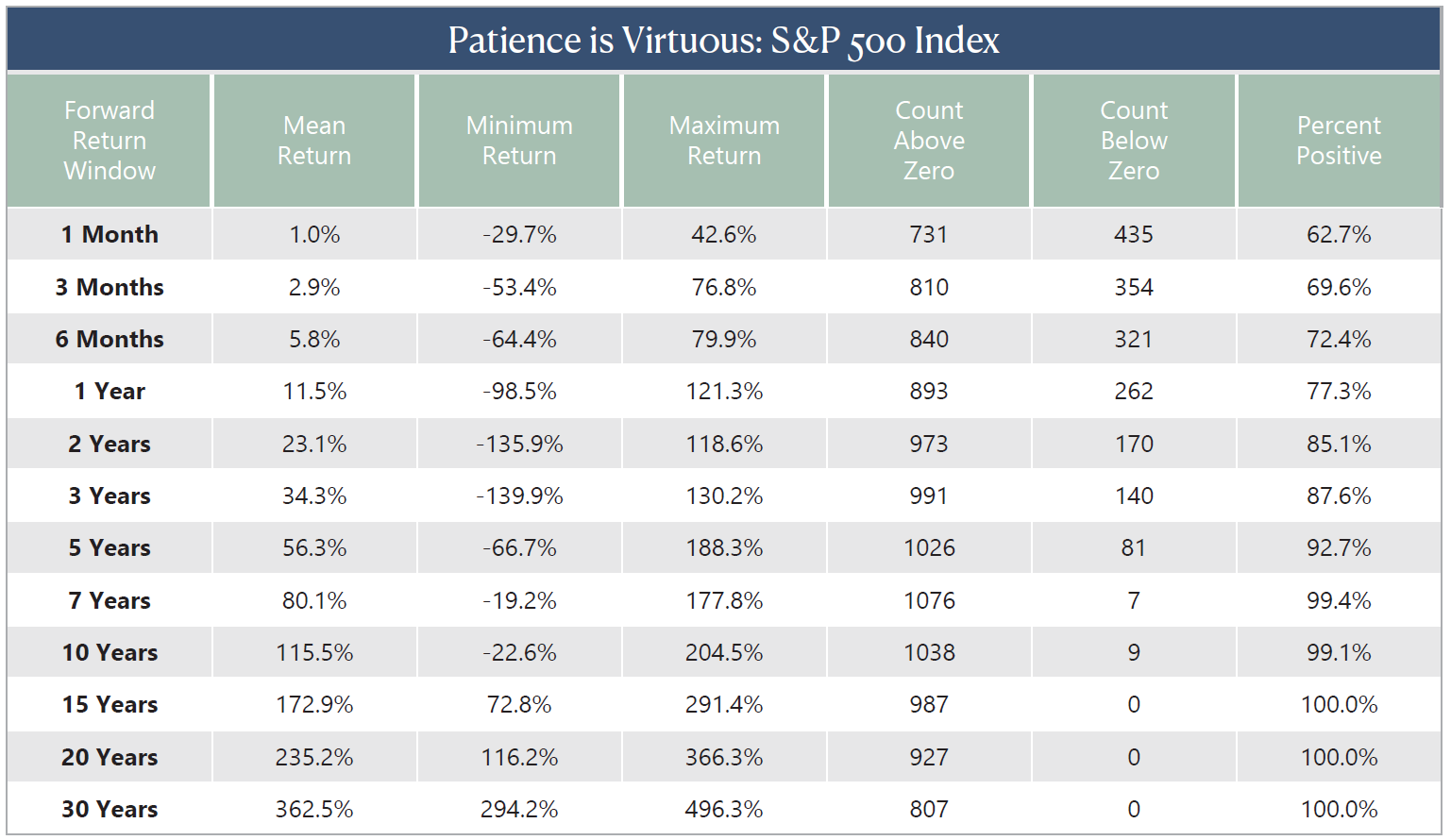
As of 02282023 Total return figures are not annualized SOURCE Kovitz using data from Morningstar and Bloomberg Finance LP
Look Ahead, Far Ahead
Unfortunately, evidence like we have presented above does little to dissuade those hellbent on using a single factor to make grand proclamations, especially to justify short-term trading activity. So it was no surprise when we saw the following headline in The Wall Street Journal on April 6, “Stocks Haven’t Looked This Unattractive Since 2007.” After a discussion about the equity risk premium (the gap between expected returns for stocks and bonds), the article said, “Stocks look pricey again today, and markets are facing a new host of challenges… That is based on the S&P 500’s price level relative to inflation-adjusted corporate earnings over the past 10 years, or the CAPE ratio. Although well off prior peaks seen in the late 1990s and 2021, the U.S. stock benchmark trades at a multiple around 29, pricier than it has been more than 90% of the time since 1881.”
We can appreciate the simplicity of a single data point, but there’s little evidence the CAPE ratio works to inform trading strategies. If anything, Figure 6 shows that stocks historically rise over longer periods of time, meaning a gain five or ten years down the road was the most probable outcome anyway, irrespective of the ratio’s latest reading. True, the percentage of positive periods doesn’t climb to 100% until the investment window reaches 12 years, but we think the odds of success remain heavily stacked in the favor of longer-term investors (even for shorter windows).
Stocks are always climbing a Wall of Worry and renewed concern regarding the stability of U.S. banks in early May has folks wondering about the potential impact of recent developments to their portfolios. While we remain optimistic for the prospects of assets under our care, factors specific to your financial situation can–and do–change. Market gyrations often serve as reminders of the value offered by a robust framework, which we believe is a critical part of the toolkit needed to achieve sustainable wealth generation and financial success. We encourage our clients to reach out to their Wealth Advisor with questions. For those not yet in the Kovitz fold, our experienced team of Kovitz Wealth Advisors would love to help you achieve your goals.


