The CAPE ratio is a valuation measure that is calculated using a rolling ten-year average of the real earnings per share (EPS) and price for the S&P 500 index. It’s a tool in an investor’s toolbox, but this Investment Insight explains why it shouldn’t be used on a standalone basis.
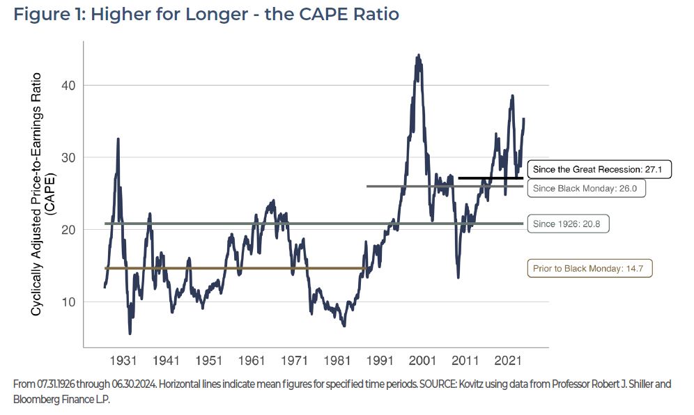
Investor attention has been focused on the long-awaited pullback in interest rates, an anxious path to the presidential election in November and the apparently brief comeback of GameStop investor Roaring Kitty. As a result, the recent uptick in the CAPE ratio has gone largely unnoticed. The current reading is 35.5 (Figure 1), which is on the high end of historical values and usually causes some level of stress for investors because it becomes a key exhibit for those who try to justify that the stock market is too expensive.
THE SHILLER P/E RATIO (CAPE RATIO) SINCE 1926
Professor Robert Shiller popularized the CAPE ratio—or Shiller P/E—in Irrational Exuberance, a book published near the peak of the Dot-Com Bubble in 2000. To solve for the issue that near-term gyrations cause P/E ratios to fluctuate wildly, Dr. Shiller’s calculation took into account a ten-year average of earnings per share and paired that with the current price. The accompanying academic analysis associated high CAPE ratios (when the market is purportedly expensive) with relatively poor future returns, while low CAPE ratios (when the market is purportedly inexpensive) were associated with higher future returns.
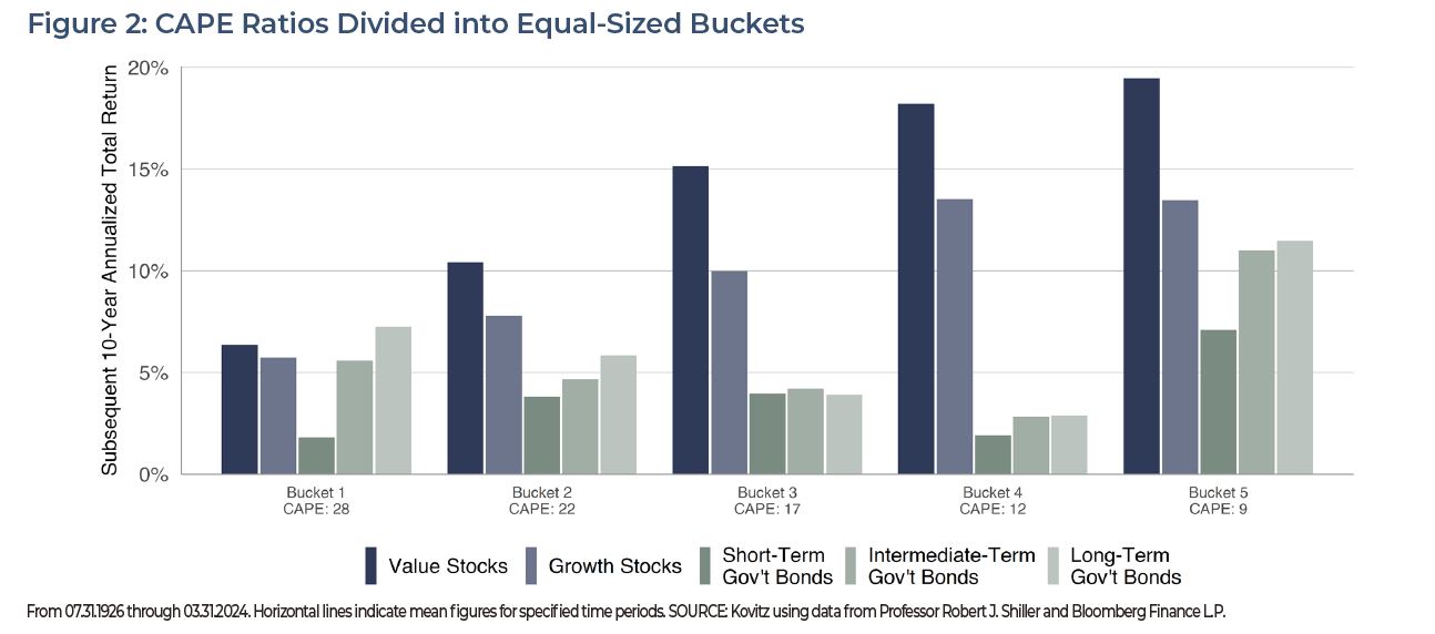
THE CAPE RATIO & SUBSEQUENT PERFORMANCE
Slicing and dicing CAPE ratios into buckets with equal membership since 1926, we find in Figure 2 that lower CAPE ratios (smaller bucket numbers) tend to correspond with better subsequent five-year returns periods than when CAPE ratios are higher (larger bucket numbers). Because rolling five-year windows exhibit significant overlap and the CAPE ratio tends to move slowly (this is considered a feature, not a defect), the conclusion that low CAPEs predict better returns than high CAPEs is less robust than it might appear.
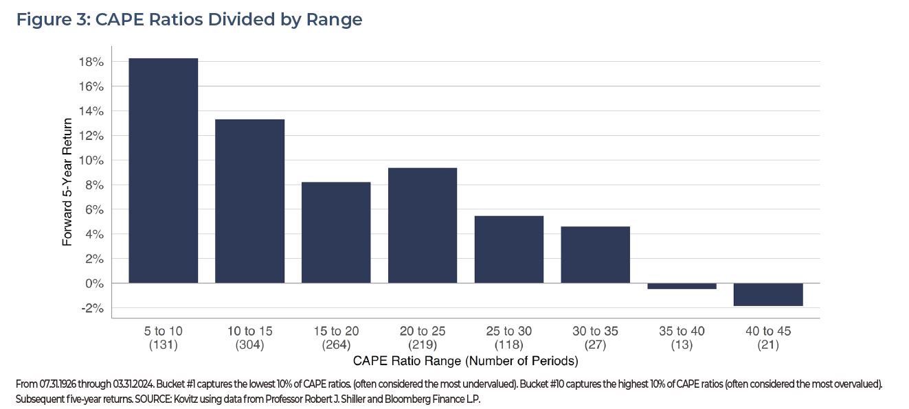
A compelling exhibit supporting the CAPE ratio’s predictive power is presented in Figure 3. Terrific five-year returns followed periods with low CAPE ratios, while subsequent performance has been dreadful when the CAPE is above 35. The details matter. There are 131 periods represented by the bar with CAPE ratios between 5 and 10. Yet just 34 rolling periods make up the rightmost bars with high CAPE ratios and all of them were from 1998 and 2000, a period followed by a steep market plunge (as measured by the S&P 500) thanks to the Dot-Com Bust AND rising prices for many inexpensively valued stocks.
S&P 500 DIFFERENCES
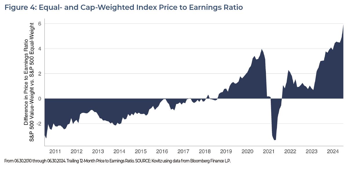
The preceding text offers evidence the time period plays an important role in indicating the stock market’s relative expensiveness. Index calculation methods matter, too. In Figure 4, we chart P/E ratio differences between the value-weight (market cap) S&P 500 index and its equal-weight sibling. The spread is usually not vast, but it can be meaningful if the metric is used as dividing line. On June 30, the trailing 12-month P/E for the cap-weighted index was 26.1, while it was 19.6 for the equal-weight version.
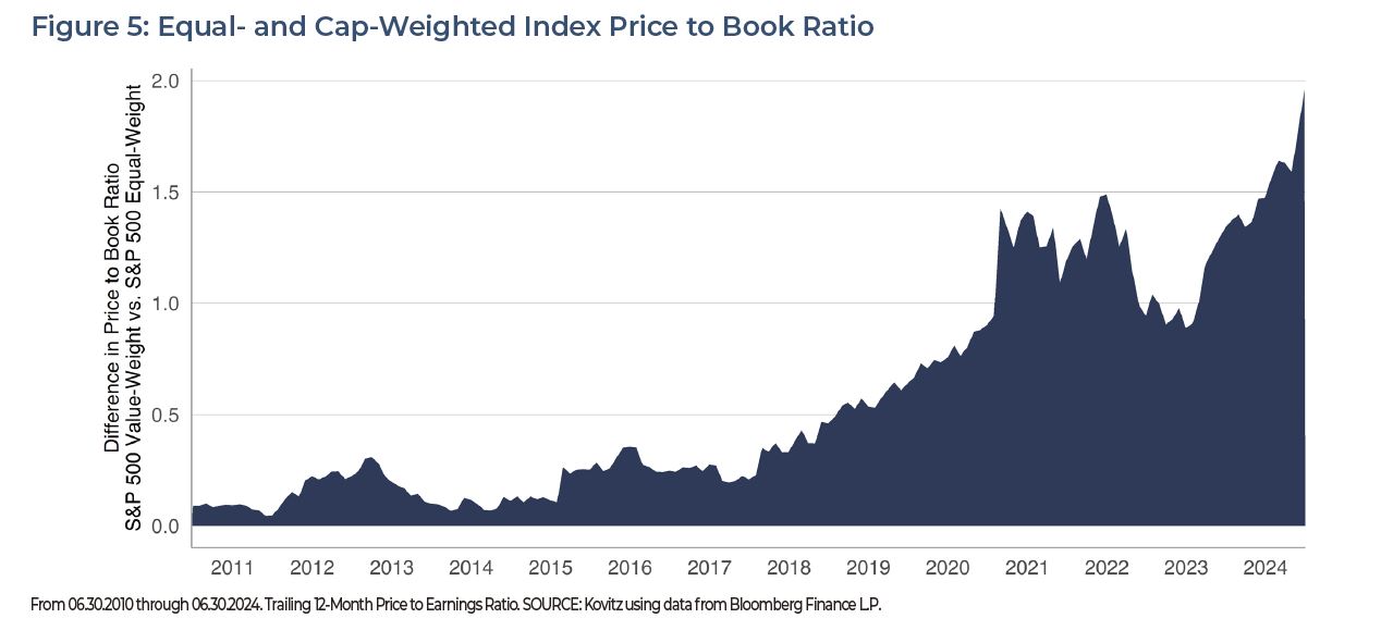
The P/E ratio isn’t the only metric gap that has widened between the cap-weighted S&P 500 and its equal-weight sibling. In Figure 5, we show a huge divergence in the Price to Book ratio, which measures a company’s stock price relative to a company’s net assets. The P/B ratio also gives an investor a general idea what the shares would be worth if the company spontaneously went out of business and had to sell its assets. While a high P/B isn’t problematic on its own, it does indicate that investors hold expectations that management will create more value from their assets.
BUY THE PEAK
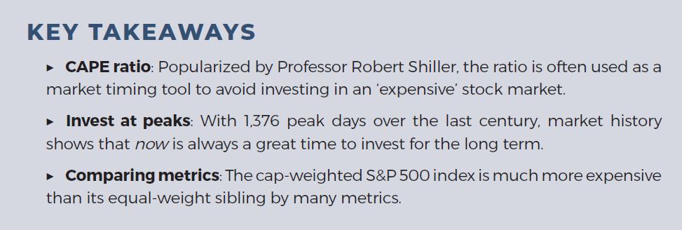
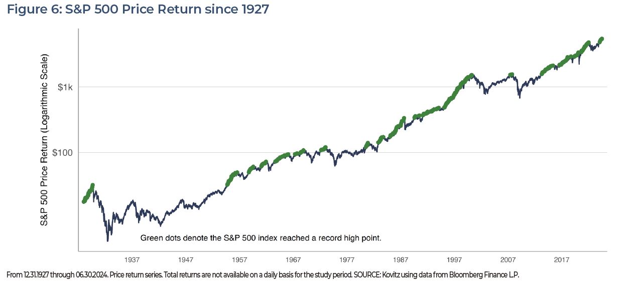
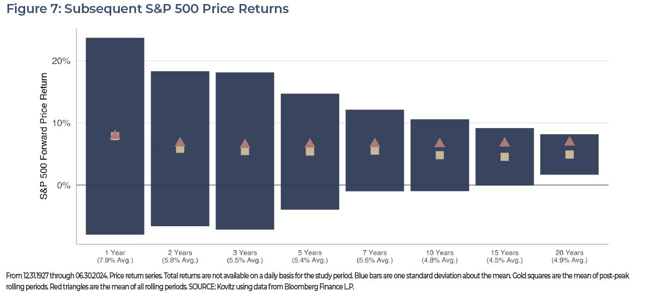
The fear of weak returns from “getting in” around a stock market peak turns out to be largely unfounded considering it is frequently cited as justification to delay putting money to work (i.e. timing the market). Figure 6 shows that in 24,240 trading days since 1927, 1,376 (5.68%) set a new record. Even though peaks tend to be clustered and there are long periods with no new records, subsequent returns don’t reveal that investors gain a performance advantage by avoiding putting money to work at market peaks.
In Figure 6, we chart the price return for the S&P 500 index for one-year to twenty-year rolling periods subsequent to each market peak. The one-standard deviation confidence interval (approximately 66% of values) is represented by the navy bars. The peak-only average rolling returns are represented by the gold squares and the all-period averages are represented by the red triangles. It might come as a surprise that one-year returns subsequent to peaks are actually above the all-period average, while longer time horizons lag, even as they are still very much in the green.
LOOK AHEAD, FAR AHEAD AND NOT AT THE CAPE RATIO
When we wrote an earlier version of this paper in early 2023, the following headline in The Wall Street Journal got our attention, “Stocks Haven’t Looked This Unattractive Since 2007.” After a discussion about the equity risk premium (the gap between expected returns for stocks and bonds), the article said, “Stocks look pricey again today, and markets are facing a new host of challenges… That is based on the S&P 500’s price level relative to inflation-adjusted corporate earnings over the past 10 years, or the CAPE ratio. Although well off prior peaks seen in the late 1990s and 2021, the U.S. stock benchmark trades at a multiple around 29, pricier than it has been more than 90% of the time since 1881.”
The S&P 500 index has climbed nearly 40% since that WSJ article went to press and it was difficult to find any mentions of the CAPE recently. Happily, one we did find in Barron’s on March 7, written by Dr. Burton G. Malkiel, which concluded, “Valuations are rich, and long-run equity returns are likely to be lower than we have recently experienced. But the stock market remains the best vehicle for growing wealth. And young people, investing regularly to build a retirement nest egg, can take advantage of dollar-cost averaging. If there is a market decline, they will be buying more shares.”
For nearly 50 years, we have been buying undervalued stocks for their three-to-five-year or longer potential, with the intention of holding them through a business cycle or two. While some may argue that stocks are at a precipice, our experience is that it’s always a great time to buy stocks and hold them through the fullness of time, with the incredible valuation gap between Value and Growth that exists today suggesting that it is a terrific time to be running toward inexpensive stocks. After all, we feel inclined to reiterate that the secret to success in investing is not simply to select good stocks, but to not get scared out of them by scary P/E ratios or calls for impending doom. Indeed, we have made money (and you can, too) over the years from stock holding as well as stock picking!
TPS Investment Insights - Understanding the CAPE Ratio, July 2024
Kovitz Investment Group Partners, LLC (“Kovitz”) is an investment adviser registered with the Securities and Exchange Commission. This report should only be considered as a tool in any investment decision and should not be used by itself to make investment decisions. Opinions expressed are only our current opinions or our opinions on the posting date. Any graphs, data, or information in this publication are considered reliably sourced, but no representation is made that it is accurate or complete and should not be relied upon as such. This information is subject to change without notice at any time, based on market and other conditions. Past performance is not indicative of future results, which may vary.


